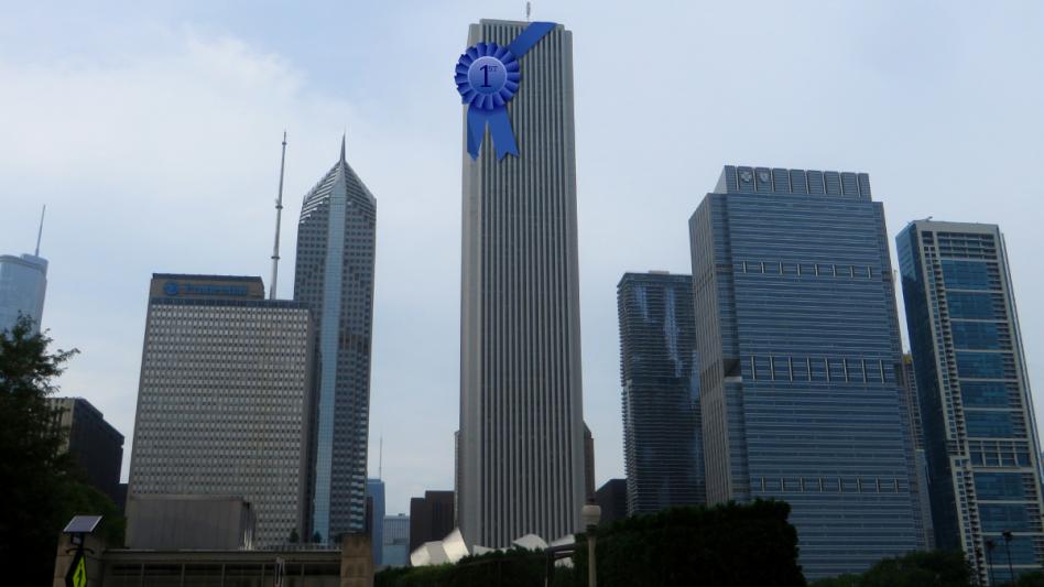
THE LOOP — In a rare win for the city of Chicago, a renowned panel of architects and aesthetic experts has awarded The Aon Tower with the esteemed recognition of “Most Featureless Building in the United States.” The Aon narrowly beat out a high rise parking garage in Tampa and a food processing factory in suburban Cleveland.
In a press conference Thursday, spokesperson for the award committee Amy Addison, 29, provided insight into the approach the committee took in order to ultimately crown the Aon Tower with this distinguished award.
Advertisement:
“When considering buildings for this honor, we have one criterion: the building must be featureless,” she explained. “So naturally we are on the lookout for any under the radar quirk or personality; any conscious creative choice that the original designers could have made. Take the CNA building down the street for example—nothing too crazy going on structurally, but the building is bright red. That’s the kind of cheeky stunt that will put you right out of contention for this award.”
Designed in partnership by architecture firms Edward Durell Stone and Perkins & Will and completed in 1974, it has been rumored that the original inspiration for the building’s overall contour and shape came from a box of saltines—imagined at an impressive scale.
“Well, it’s 80 stories of ‘not much,’” explained Ed Fleecevest, 52, award search committee lead and Principal at the LA-based AECOM architecture firm. “With every floor you look up, the stakes increase: ‘Surely there’s got to be some kind of spire at the top, a new window scheme, or even some measly decorative trim?’ you think to yourself. But no. Just grey concrete slats and little slit windows for all 1100 feet.
Advertisement:
“The moment I walked up Lake Street and saw the Aon Tower for the first time,” Fleecevest reminisced, “I get emotional talking about it. Its featurelessness took my breath away. I knew we had our winner.”
“We’ve never seen such an expression of the elusive concept of “nothingness” before,” added Jenn Wireframme, 37, fellow panel judge and art critic for Aesthetica magazine.
In her post-mortem writeup, Wireframme opined, “It’s quite simply sublime—camouflaged in the overcast sky, the Aon Tower looms in this uncanny valley territory of almost looking like a building; and thus it inspires this dull terror in the viewer—as one tries to project features onto it that simply are not there. Moreover you have to appreciate the harmony here between subject and object: Aon is a risk management advisory firm, and they’ve headquartered themselves in a building that takes zero aesthetic risks, as it were.”
Advertisement:
“The Aon also subverts this trope of the high and mighty ‘ivory tower’ by parodying it,” she observed in the piece’s conclusion. “What we have here is this real life, ersatz ivory tower that makes pedestrians think, ‘I’m good down here, thanks.’”
When asked if the building’s award-winning status had changed his opinion of it, local pharmacy technician Allen Smith, 26, said, “That thing? People work in there? I assumed it was a water filtration site or something.”


